George Miller has often told the story of watching the black and white dupe print of The Road Warrior the composer needed for scoring, and liking it better than the color version. He tells it again in an intro for the new Black and Chrome version of Fury Road. He watched his new movie in black and white, and thinks it’s the best version there is, though he concedes that in some scenes, detail is lost.
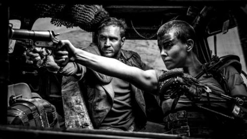
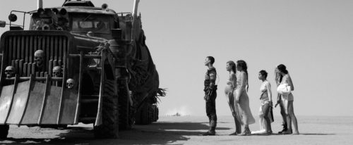
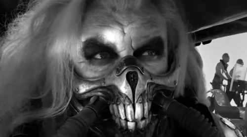
I have now seen the Black and Chrome version. I think Miller may be right. I can’t tell for sure after only one viewing, but it feels right. Though it’s a stunning movie in color, the intensity of the colors gives the movie a kind of cartoonish vibe very different from The Road Warrior. In b&W, it’s no longer a cartoon. It’s like The Seven Samurai. Stark and intense.
Out there on the interwebs I see people saying, “Why can’t I just turn my TV to b&w and get the same effect?” The answer is “because color correction, bozo.” Especially now, in the world of digital cinema, you can change everything about what you’ve shot. In terms of actual colors, this means you can bathe your movie in orange and teal if it’s what suits you, or take it some other direction. Black & white is no different. There are an infinite variety of black and whites to mess with, and pushing a button on your TV is without a doubt the lamest available. All you’d be doing is desaturating an image fine-tuned to look great in color.
But so anyway, the point is, the b&w version looks gorgeous. It glistens and it shines. It adds a kind of distance to the movie, imparting a sense of ancient, epic importance. It’s somehow more grand, despite its austerity.
Having seen the movie numerous times in color, it took me awhile to adjust to the new look, or more exactly, to allow myself to simply fall into its grip without my mind constantly replaying what it used to look like. Which is why I’m going to need to watch it again to really get the true feel of it. Maybe the next three times I watch it will only be in b&w, until my brain it tricked into forgetting it was ever in color. At which point I can go back to color and blow my mind into tiny bright orange bits. Or maybe not; maybe I’ll be appalled by its garish palette and never go back.
Miller nails it when he says many scenes simply work better in b&w, whereas in others there’s a loss of detail. I felt the loss most prominently in two sections.
First off, night time. In the color version, there’s a big difference between the look and feel of the night sequence versus the day sequences on either side of it. Shot at high noon for a weird and unsettling effect, the night is blue and washed out. Though action packed, it creates a kind of pause in the rest of the non-stop chase. In b&w, this feeling is lost. It’s night, so it looks different, but not very much different. The strange day-for-night effect isn’t nearly as noticeable. It doesn’t quite play as well without the wash of blue. And because it’s monochrome like the rest of the movie, the sense of it being a separate section is also lost.
Now with that said, maybe it doesn’t need to feel like a separate section in the same way the color version does. Used to the color, I noticed its absence. But maybe in the future I won’t mind.
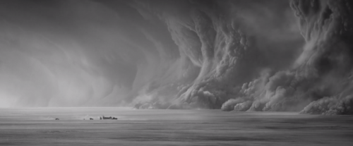
The other section where a loss of detail is most noticeable is when the chase leads inside the storm. Depth is sacrificed. In the color version, there’s a real sense of being within something vast and deep and horrifying. Lightning and tornadoes flash and whirl far in the distance. Clouds of varying shades roil and churn. But in b&w, this sense of otherwoldliness is lessened. I couldn’t see as clearly into the distance beyond the action, so, like the night sequence, what before stood out as a separate world blends more smoothly into the rest of the movie.
Again, maybe not a bad thing, maybe only a different thing, (maybe a better thing?), but I felt the absence.
Other than those two sequences, I’m having a hard time coming up with anything else potentially negative to say about the b&w version. Fire, I guess? Flames will always look better in color. Fire is scary. Lacking color, it feels a little more abstract.
But man, this movie kills in b&w. It’s just not something you see, ever, a big-budget action movie not in color. It’s unheard of. Only arty films get the b&w treatment nowadays. Which of course plays a part in how we interpret these kinds of images. Our brains have been conditioned to process b&w movies as either old or arty. Show them (the brains) a modern action movie, and they run around in circles waving their arms and shouting incoherently. They don’t know what to make of it, they don’t know what it means. What kind of movie is this, they ask? For me, my brain kept going back to The Seven Samurai.
It makes me wonder how one of these Marvel movies would play in b&w. Not as well as Fury Road, because they’re worse films to begin with, but still, seeing superheroes in their shiny costumes without the distraction of color could have an interesting effect.
It helps too that Fury Road’s story is one of mythic simplicity. Ancient stories cry out for b&w. So, yes. The upshot here is, you must watch this. Probably a whole bunch of times. Because that’s what true scientific investigation demands of us.
I absolutely agree with every point. As I was watching it, I was thinking “I will never watch the color version again.”
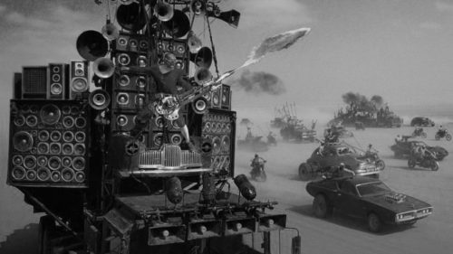
Then, when we got to the chase (and specifically Guitar Guy’s money shot) I felt a little sad because it lacked the punch (nor did it inspire the same hysterical/joyful laughter in me) because the flames from his guitar didn’t pop.
And the intensely unique night sequence felt a little flat. Almost like it was not night (which clearly it isn’t, highlighted in this version), but some weird fog.
But who cares? This version is superior in every other way. I will watch both now, alternating from one to the other (although undoubtably favoring the b/w chrome version).
Long live chrome.